How We Built Syntax Highlighting for the Terminal Input Editor
Advait Maybhate
- Why We Built Syntax Highlighting
- Styling Text Within Warp
- Command Parsing
- Launching The Features
Why We Built Syntax Highlighting
Command entry is the cornerstone of any terminal - we wanted to make sure users had the best experience possible when crafting commands. The major pain points we were attempting to address from our users were:
- 1.
Users mistyping a command name resulting in an error. There was no easy way to differentiate between existing and non-existing commands - Issue 66
- 2.
There was no visual way to differentiate between the different parts of a command (subcommand, options, arguments, variables, etc.)
- 3.
Existing plugins/shell support for similar features were not being supported within Warp - Issue 1211 or Issue 1177
Note that this is due to our custom input editor, which allows us to support features such as selections or cursor positioning but means we can’t support ANSI escape sequences used for traditional terminal styling (check out Zach’s blog post for more details on our input editor!).
Going through the process of writing the PRD (Product Requirements Document) for this project, I played around with other implementations of similar features, with zsh-syntax-highlighting or the fish shell, which both support syntax highlighting. Beyond the terminal, I also took a look at how text editors and IDEs such as VSCode or IntelliJ IDEA tackle these issues - at the end of the day, we want Warp’s input editor to feel like a fully-fledged modern code editor. This exploration was able to better inform the features we wanted to tackle within Warp and their prioritization.
From writing up the PRD, I identified the two features we wanted to initially start with:
- 1. Error underlining - underlining invalid commands with a red line to indicate the user may have made a mistake.

Example of Error Underlining
- 1. Syntax highlighting - color text within the input editor to visually differentiate between the different parts of a command.

Example of Syntax Highlighting
Styling Text Within Warp
In starting the technical implementation, we realized that we didn’t have the ability to style text in-place. In other words, we could style text when initially rendered in our editor, however, we couldn't update the styles afterwards. For this project, we needed this ability to add a red error underline or change the text color dynamically. Hence, we decided to dive into the core text editor fundamentals and reevaluate how we represented text within Warp. Having worked with higher-level abstractions such as React components for text decorations in the past, I thought how hard could it be? Turns out, it can be pretty tough 😅!
Within Warp, we have a fully-fledged input editor for user input, as mentioned above. This means that typical implementations for styling glyphs in terminals, such as ANSI escape sequences, won’t work. For the input editor, we define our own primitives for styling text, using Apple’s Metal graphics library - for example, we’ve built a custom method to draw a rectangle for underlining text (see Michelle’s blog post that dives deeper into Metal).
Let’s take a look at why styling text is a more complex problem than it initially appears.
In the steps below, we’re adding styles to a command:
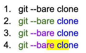
Note that the example above is shown for illustrative purposes and doesn’t reflect the “correct” syntax highlighting of this text which has a command, option and subcommand. This is because we wanted the ability to generically update styles for a piece of text, including handling any cases of arbitrary styling.
First, let us define a “part” to be a contiguous section of text that has the same style. Let’s take a look at the number of parts in each step above:
- 1. We have 1 part: the entire text has the same style (default - black color).
- 2. We have 2 parts: green and blue contiguous text (“git --bare” and “ clone”).
- 3. We have 3 parts: green, purple and blue contiguous text (“git”, “ --bare” and “ clone”).
- 4. We have 5 parts due to the yellow highlight that was added:
“git” - green foreground color
“ --ba” - purple foreground color
“re” - purple foreground color & yellow highlight color
“ clo” - blue foreground color & yellow highlight color
“ne” - blue foreground color
From the above example, you can see that each of these parts needs to appropriately get “spliced” when we style in-place. We need to also merge the text styles together and override where appropriate (e.g. a new foreground color is applied). In some cases, the range you’re applying a text style on could be a strict subset or superset of another text style range, so it’s important that merging styles and splicing ranges should be handled appropriately.
At a high level, we use a concept similar to these “parts” to represent snapshots of text state, including styles. At a lower level, within the input editor, we represent text using a SumTree custom data structure, which is similar to a Rope data structure used in other text editors. It allows us to index into the data in different dimensions quickly (e.g. based on characters, bytes, lines, etc.) The benefit is that many operations generally can be achieved in O(log N) time.
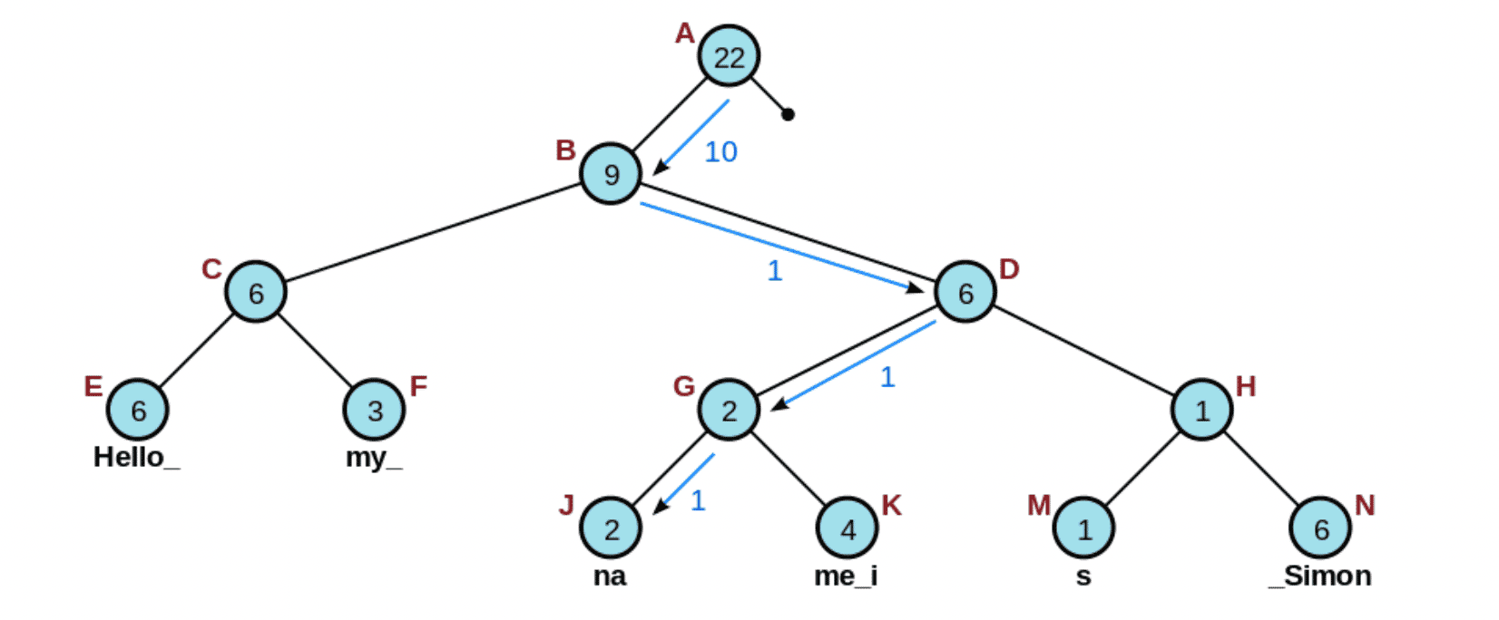
An example of indexing into a specific node of a Rope, given a character offset of 10 (credits to Wikipedia)
Let’s take a look at what the "git --bare clone" example would look like within SumTrees (note that we’re glossing over some of the complexity of the data structure for illustrative purposes e.g. keeping track of when text is inserted/deleted). Specifically, let’s try representing the last 3 lines from the example above in a SumTree. First, we start off with 2 child nodes representing parts of different styles:

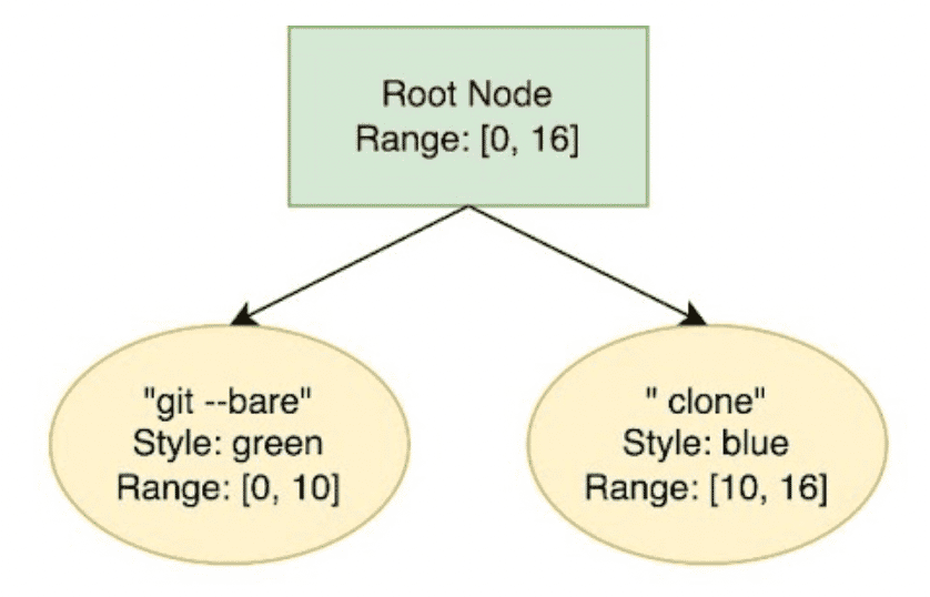
Next, we splice the “git --bare” into 2 separate nodes to represent the different parts:

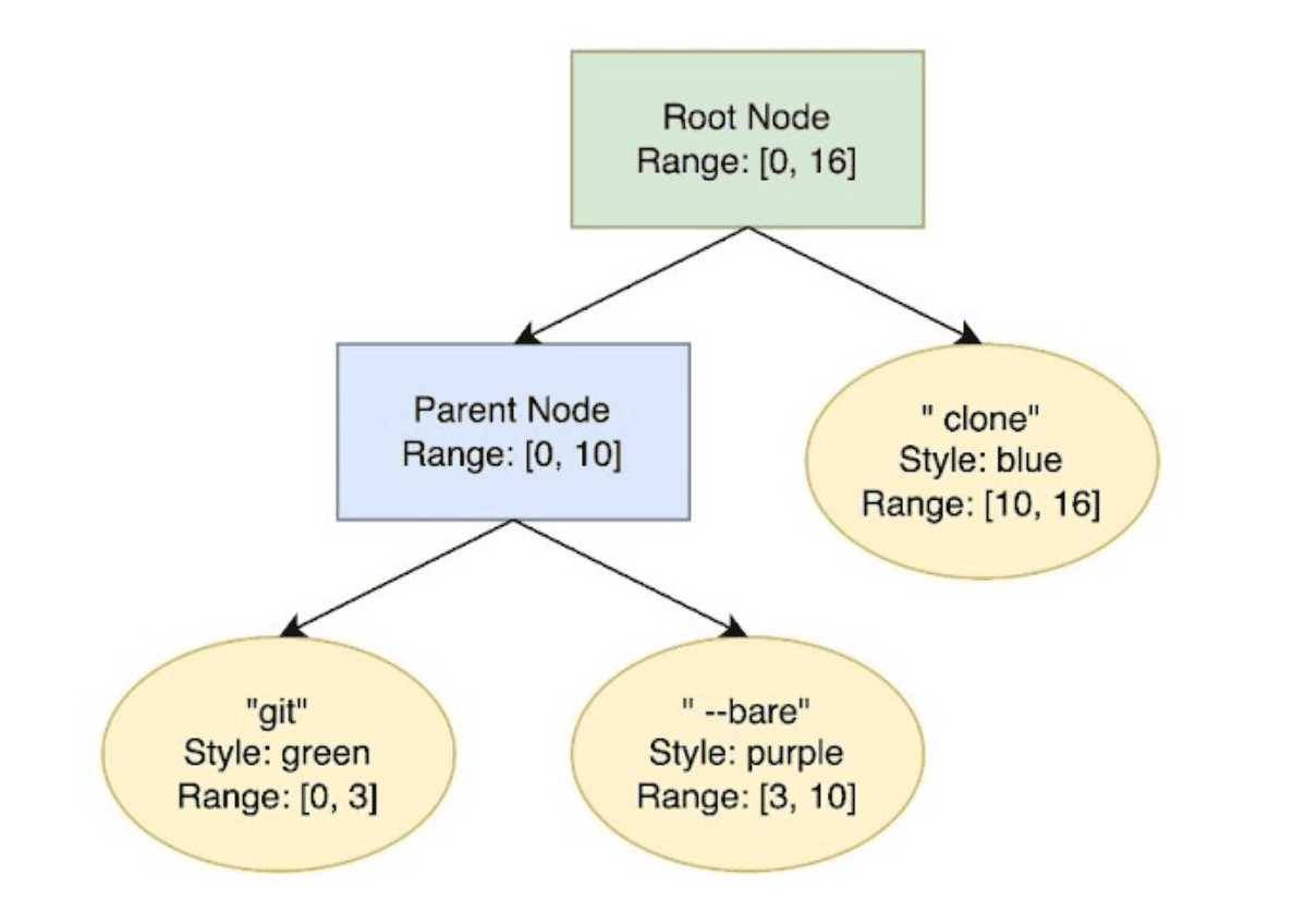
Finally, we splice both the “ --bare” and “clone” nodes to handle the highlight operation for updating the style:

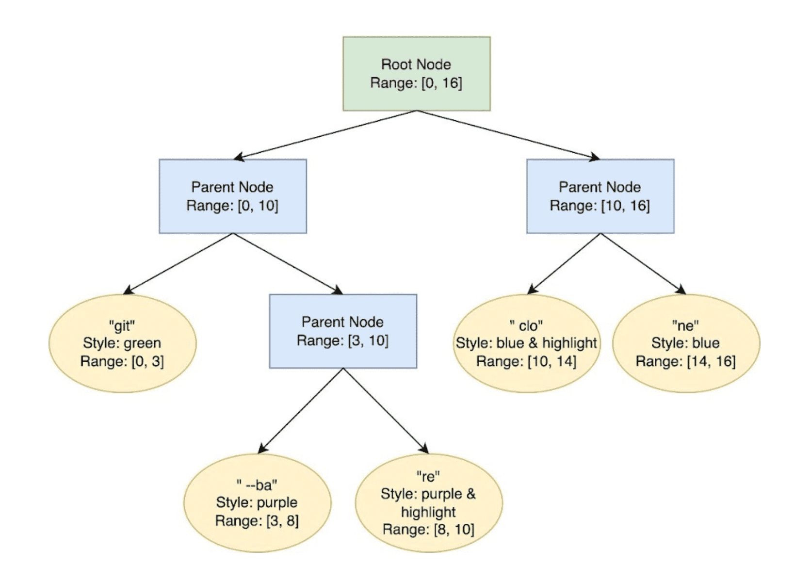
Above, you can see that the SumTree stores some aggregate statistics such as the range of the text (note that range is exclusive at the end bound). We can add other such dimensions onto a SumTree, such as storing character, byte and line offsets. Notably, we’ll also re-balance the tree as needed when adding nodes, to keep operations within logarithmic time. Storing data in this manner allows us to easily and quickly make updates in the middle of a chunk of text, like adding or deleting text, updating styles, and more.
Adding to the complexity, we have the concept of “inheritable” text styles. In a text editor such as Google Docs, if you change your foreground text color to blue, you’d expect any text inserted within that snippet or immediately after that snippet to “inherit” the same style (i.e. also be colored blue). However, automatically inserted text styles, like error underlines telling you that you have a typo, shouldn’t be inherited! Previously within Warp, our text styles were all inheritable, however, we need non-inheritable styles for the error underline, which we introduced. To illustrate this, we can take a look at the following example:

In the above example, after changing “gitt” to blue, you expect the text style to be inherited for “checkout”. However, you do not expect “checkout” to inherit the red undercurl indicating that “gitt” is incorrectly spelled. We want the same concept for Warp’s error underlining and syntax highlighting, hence we added this distinction at the text style level. After an error is fixed, we’d like to be able to “clear” a text style as well - we also added this operation into our new internal API for updating text styles in-place.
Hence, we added the ability to style text in-place within Warp’s input editor at the level of SumTrees, keeping in mind the considerations outlined above - my first time dealing with binary trees at work, a very fun adventure 🌲!
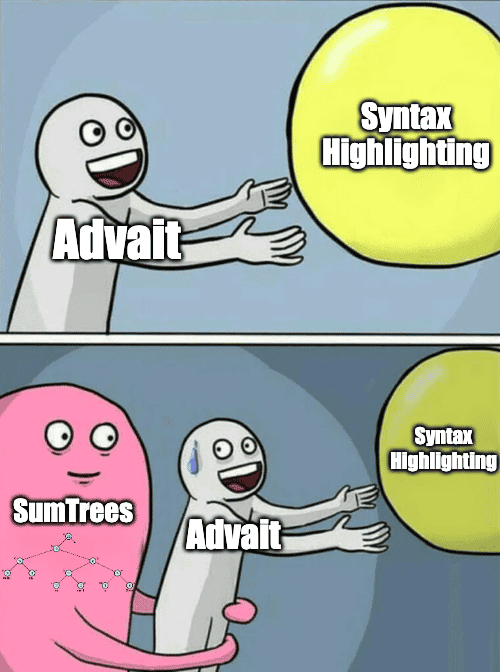
An accurate depiction of me grappling with SumTrees 😛
Command Parsing
Within Warp, we’ve built a custom command parser that’s loosely based on Nushell. This parser powers existing features within Warp such as Command Inspector, Autosuggestions, or Completions. Thus, for this project, we re-used parts of the parser for knowing whether a command is invalid (error underlining) and the different parts of a command (syntax highlighting).
For error underlining, we purposely don’t want to red underline a piece of text the user is typing until after the user has completed what they’re typing. For example, red underlining “gi” doesn’t help the user if they’re about to type “t” for “git”. Hence, we added in debouncing at a longer interval for this feature. Debouncing refers to the concept of delaying calls to a particular trigger-based function until some time has elapsed since the last trigger event. In other words, we wait until we’ve detected the user has stopped typing before red underlining invalid commands.
We also added “short-circuit” triggers on certain operations to ensure that we instantly compute the relevant styling when we know that the user has completed a specific token e.g. pressing space, pasting text into the buffer, cursor selection elsewhere, etc.
Notably, we also needed to be careful of the performance considerations of command parsing for these use cases. To ensure that the typing experience did not experience any regressions, we run all of these computations asynchronously. Additionally, we debounce these events to prevent any sudden overload of function calls being made - as noted above, it also makes sense from a product perspective for error underlining.
Launching the Features
Near the end of my internship at Warp, I was able to launch these features to all of our users, which was super exciting (definitely one of my biggest launches)! For the purposes of discoverability, we made them opt-out - a nerve-wracking but exciting launch!
It was crazy to me that I was able to build out such a critical feature and launch it to all of our users, in the context of an internship, where it was my first time touching Rust. For anyone debating whether they’d want to work at Warp, I can confidently say it’s a truly awesome team where you’ll be able to have tons of impact! A special shout-out to my mentor, Agata Cieplik, who always responded to my flurry of Slack messages, gave me super thorough code reviews, and had some awesome meme-creation talent (I love memes 😛)!
Below, you can see both error underlining and syntax highlighting in action, with our default Warp Dark theme 🎉:

Visually, we can represent this launch quite succinctly in a meme:
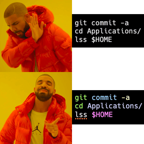
Drake loves Error Underlining & Syntax Highlighting 😉
Go try out the features and give us your feedback! You can check out the documentation for these features here as well.

