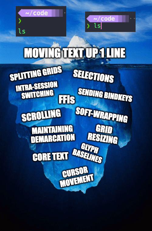
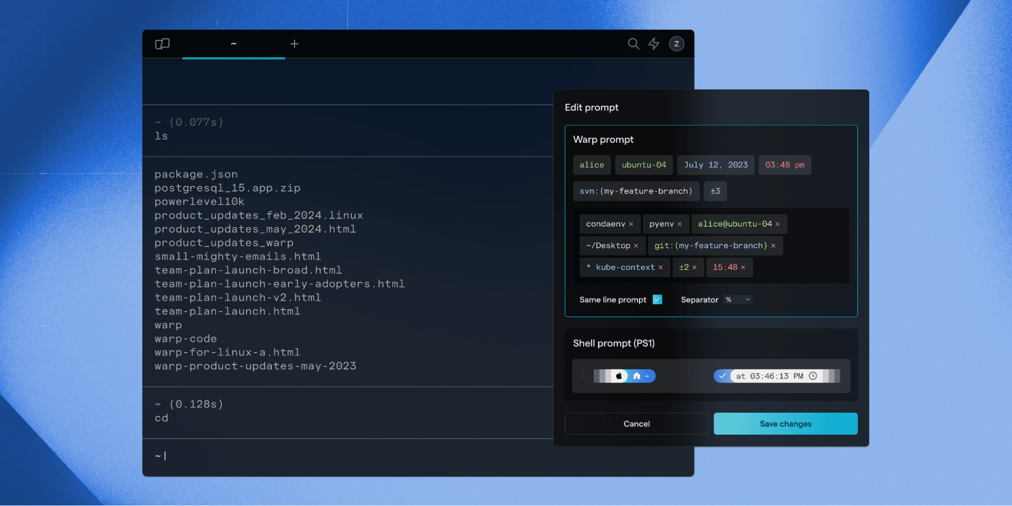
We just launched the option to enable Same Line Prompt in Warp. Let’s talk about it!
Introduction to Same Line Prompt
Most classic terminals have an input editor that sits inline with the shell prompt on a single line. By default, Warp’s prompt puts the input editor on a new line that sits below the shell prompt.
Early on, this quirky new line prompt was a design trade-off that enabled Warp to support some novel usability features for the terminal, including grouped blocks of commands and block actions.
However, as more and more developers started to switch to Warp from their legacy terminals, the requests for the more traditional “same line prompt” experience came flooding in. Same Line Prompt became Warp’s most highly requested feature in 2024.
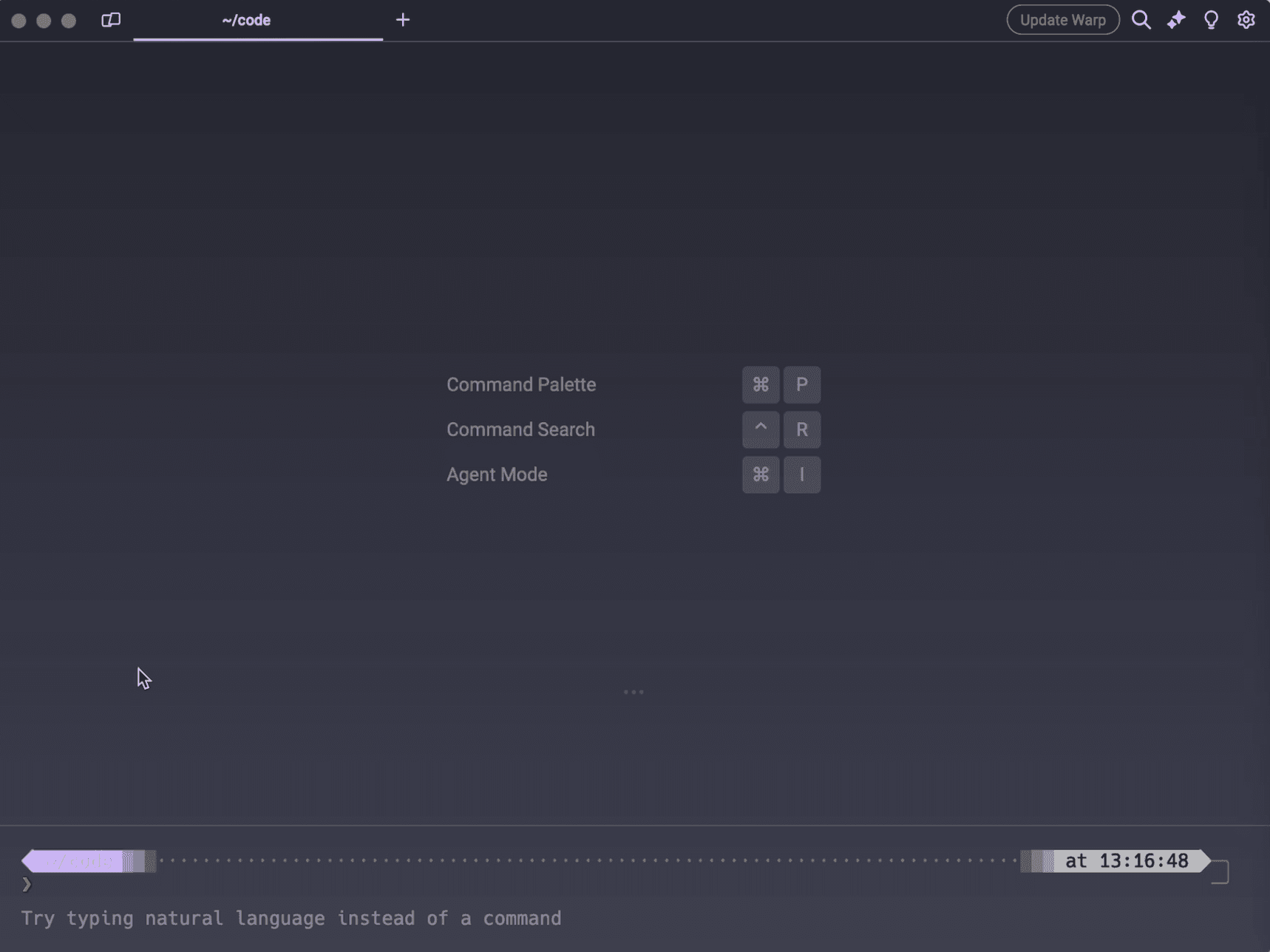
A custom prompt in Warp with the old new line prompt style (Warp's default)
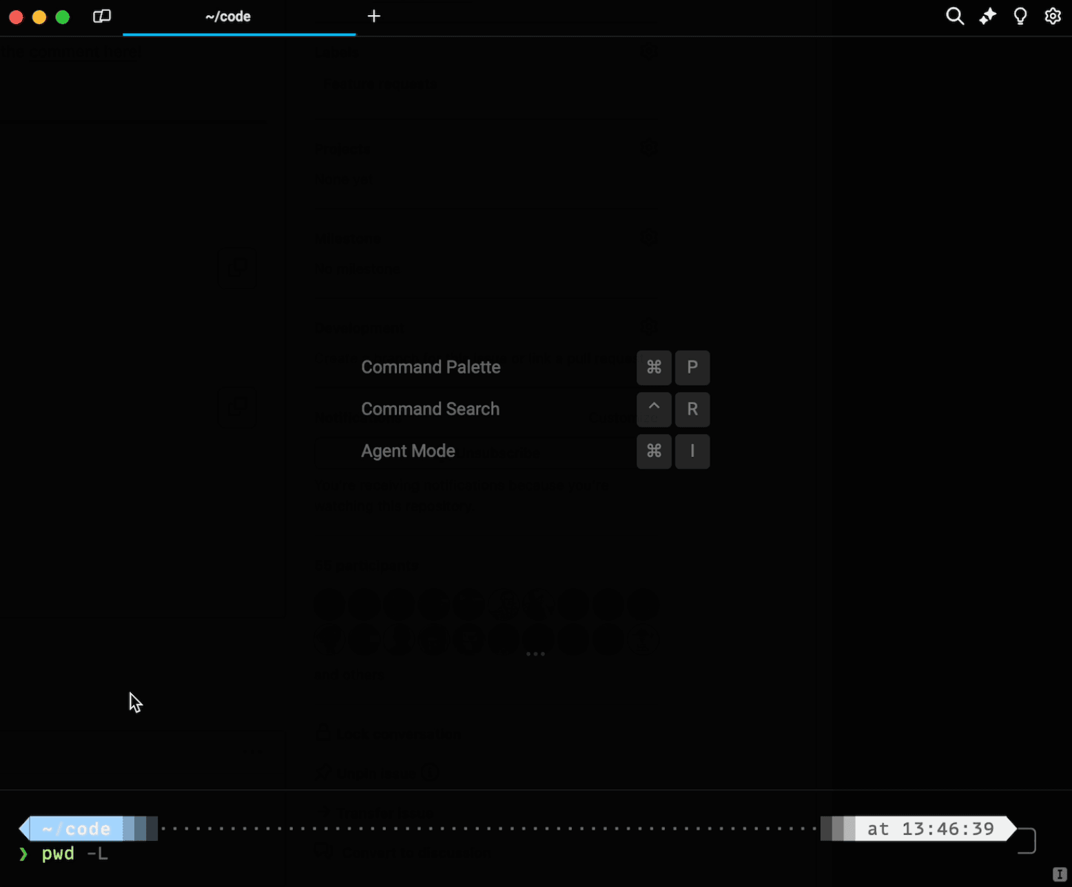
New Same Line Prompt setting applied to a custom prompt in Warp
The most common reason for requesting the Same Line Prompt was to have a familiar experience. Some developers shared that the new line prompt was too confusing and it caused them to switch back to iTerm2.
Others explained that the multiline experience took up too much vertical space in their terminal, or that a blinking cursor on a new line signaled that a long-running command was running.


Whatever the reason, we knew it was important to respect developer preferences. A comfortable prompt and input editor is table stakes if you’re going to use this terminal as your daily driver. We prioritized the request and got to work.
What seems like a minor feature was actually technically complex to implement because of the way Warp’s Rust-based UI relies on a strict grid system.
How did we implement it?
We’ll break down how we approached the project in this blog post. You can also watch the video interview if you’d prefer to watch and listen instead of reading along:
First, let’s explain how the default prompt experience works in Warp.
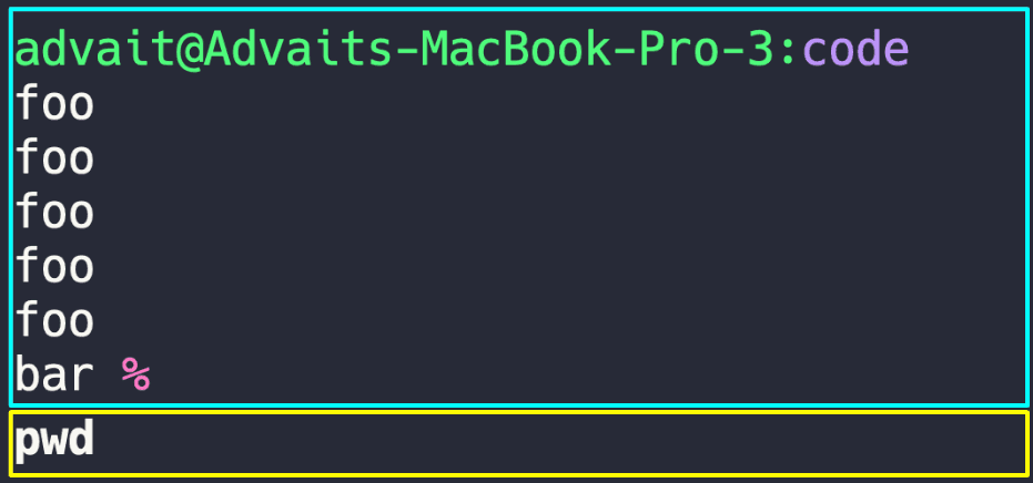
Warp’s terminal experience can be broken down into two main components:
- First, there is the prompt, which is a Grid component.
- Second, there is the Input Editor, which is its own separate component.
You can imagine this layout as two rectangles (the prompt component and the text editor component) stacked on top of each other, neatly separated.
Why does Warp separate out these components into different grids?
As mentioned briefly earlier, we make the input editor its own component so that it can support a richer text editing experience. This separation makes it possible to support modern text editing, autocompletions, and AI command suggestions in the editor.
Separating out the prompt and the input editor allows us to provide different context menus or features depending on which grid you’re hovering or clicking on.
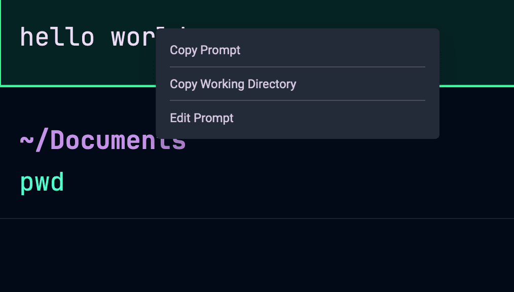
Warp can display a context menu specific to the prompt.
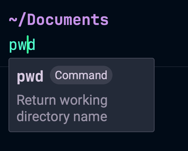
Warp displays relevant command descriptions on hover.
Now, let’s see what happens when we introduce the same line prompt experience…
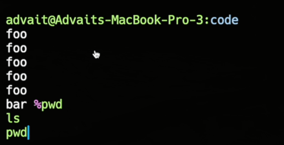
You can imagine that we can no longer have two rectangles neatly stacked on top of each other, since the last line of the prompt and the first line of the command should now exist on the same row. To solve this issue, we split the prompt into two separate grids. In this case, the first prompt grid would cover the first five “foo”s, and the second prompt grid would cover the “bar %.” This allows us to put the input editor component inline beside the prompt.
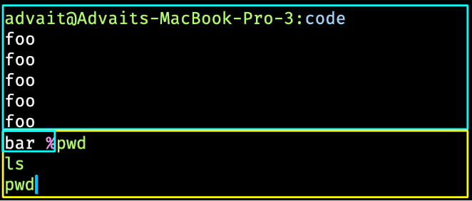
You may notice that even though we’ve separated out the prompt into two grids, the last line of our prompt still overlaps with the input editor component. In our code, we are having the input editor component now include this truncated prompt grid as part of the component, in what we’re calling the “left notch.” Notably, introducing this left notch into the input editor component leads to a lot of downstream effects in scrolling, text selection, and soft wrapping that we’ll talk about next.
Scrolling
In the default Warp experience where the prompt and the input editor are separate, the prompt will stay put no matter how much text is typed in the input editor. However, in the case of same line prompt, users expect that the prompt will scroll up alongside the input editor text.
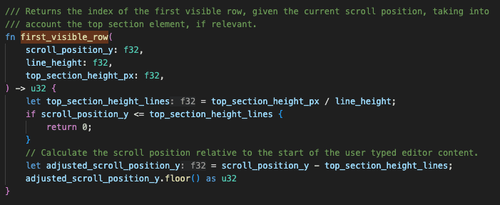
Additionally, to optimize performance within Warp, we also don’t render lines of text that are calculated to be “off-screen.” Hence, we need to update the logic that detects the “first visible line of text” in the Input Editor to account for this new scrolling behavior.
Selecting Text
This new left notch adds some interesting complexity to the logic of selecting text in the input editor as well. Let’s take this example:
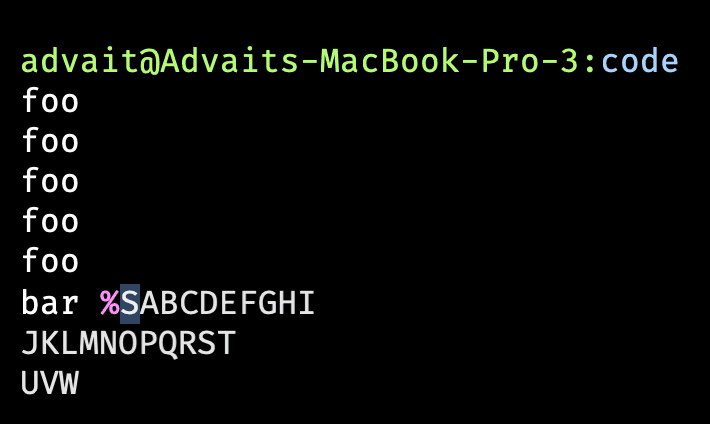
In this example, we have two different coordinate spaces to consider. The first is the window coordinate space, where the highlighted “S" would have absolute X and Y pixel coordinates. The second is the Input Editor coordinate space, where the highlighted “S” would be at row 0, column 0. Previously, the translation between the two coordinate spaces was easier, but with the existence of this left notch you can imagine that row 0, column 0 of the first line is actually now offset by some amount of characters.

Accounting for the left notch shift in the code.
Text wrapping
We use different libraries to render text in our input editor across platforms. For Mac, we use Core Text and for Linux we use COSMIC Text. We interface with these libraries by telling them the size of our Input Editor rectangle, the text that we want to put inside that rectangle, and other details like the font being used. The library will then tell us how to wrap the text correctly. (There’s a lot of work happening under the hood to determine how much space these rendered glyphs will take up). This is how we can soft-wrap text, like so:
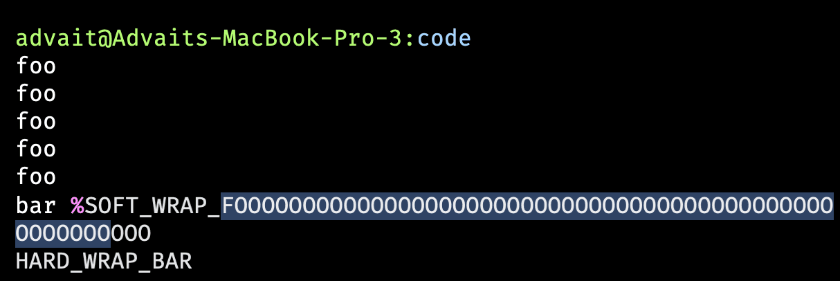
However, with this new concept of the left notch, the shape that we are passing to the text library is no longer a perfect rectangle. We want to ignore the top left chunk that the prompt occupies on the first line. If we were to keep the logic unchanged, the soft-wrapping would occur a few letters after the actual end of the line.
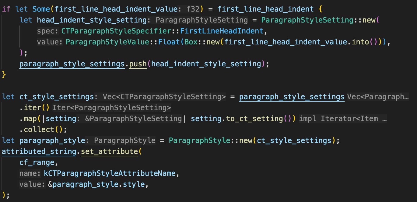
In Core Text, we use their special option firstLineHeadIndent, which essentially acts as the same types of indents you would see in a high school English essay, for example. We realized that this left notch was essentially an indent, and, as such, we were able to leverage the firstLineHeadIndent to do wrapping correctly. The other option we considered was defining a custom polygon (using CGPath from Core Graphics), which would have been possible but a much more complicated approach.
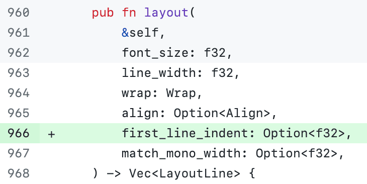
On the Linux side, we added the functionality of indentation to COSMIC Text, which is an open source library. We hope to merge the changes from our fork upstream soon! A small snippet of the core changes are included below:

Same line prompt with finished blocks
So far, we’ve been talking about the Input Editor and prompt in the context of typing commands. However, the same line prompt brings even more complexity into the implementation of finished blocks as well. For readers who are not as familiar with Warp, finished blocks are essentially commands that have been run, and they are rendered together in a “block” unit, like so:
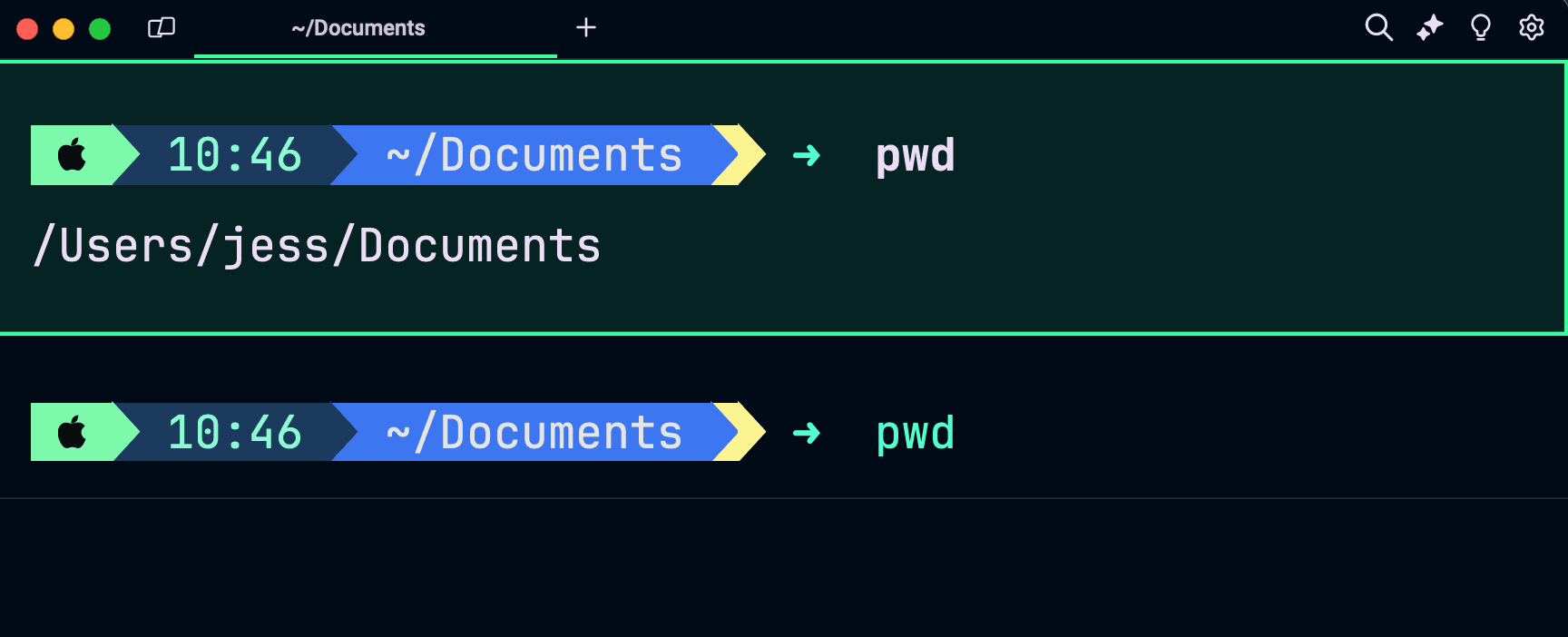
In the default Warp experience, we had four grids that existed in our finished block: the lprompt grid, the (optional) rprompt grid, command grid, and the output grid.

Maintaining demarcation between the prompt and the command
Again, Warp separates out different UI components of the terminal into different grids so that we can make the experience more feature rich. In this context, we give you the option to copy the prompt or command individually, if you right click on the block.
With the same line prompt changes, we now want to combine the lprompt and the command grids into one grid. This is necessary to get things like soft-wrapping, hard-wrapping, text selection, and scrolling to work correctly. But there still needs to be a way to tell the difference between when the user is interacting with the prompt versus the command in a finished block so we can continue to provide that feature-rich experience. We solve this issue by using a demarcation marker, which is essentially an invisible marker that is being put on the last cell that the prompt is using.
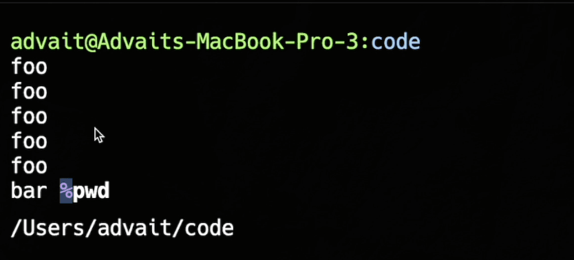
In this example, the highlighted cell with the ‘%’ contains a hidden bit of information that indicates to Warp that this is the last cell of the prompt. In other words, everything before that demarcation is the prompt. Everything after that demarcation is considered the command.
Another approach could have been to continuously keep track of the exact row/column coordinates of the split between prompt and command. However, the reason why we took the approach of using the demarcation is that it holds up even when the terminal window is being resized, whereas the coordinate system approach would have required a lot more complicated math. Notably, we do cache the demarcation values, so we don’t need to re-scan the grid, unless it’s been resized, in which case we invalidate the cache.
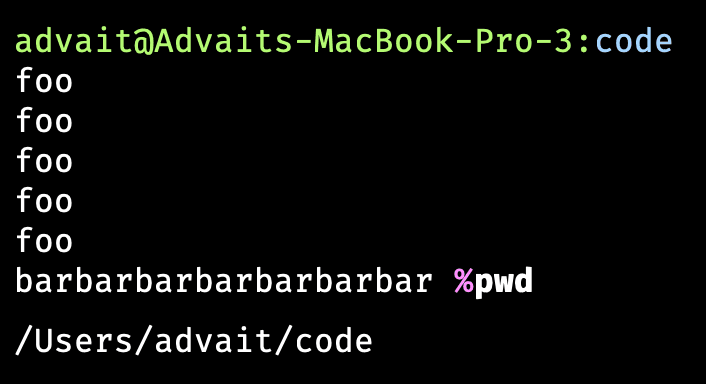
Before resizing down.
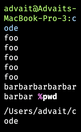
After resizing down.
You can see how the prompt and command can shift significantly in this scenario, but we still want to ensure that specific actions like “Copy Prompt” and “Copy Command” are still working as expected, based on the grid’s contents.
Supporting both Warp prompt and shell prompt (PS1) experience
In Warp, you can choose to use Warp’s prompt, which can be customized, or you can use your shell prompt (PS1). Many developers choose to stick with PS1 so they can use custom prompt themes like Starship or Powerlevel10k.
Now that the Same Line Prompt setting is available, the default experience with shell prompt (PS1) is the new same line experience.
If you choose to use Warp’s custom prompt instead, we also give you the option to enable or disable the same line prompt setting.
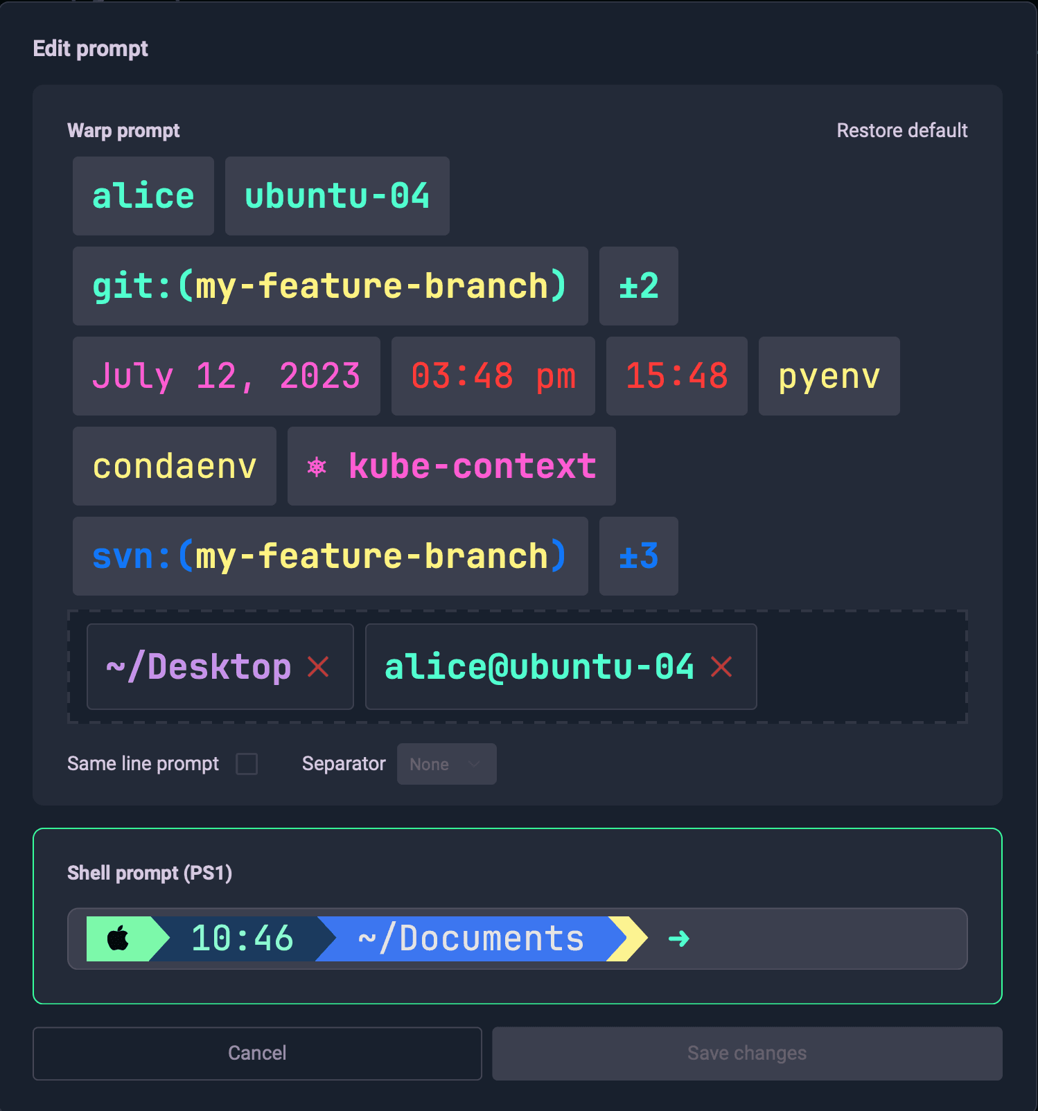
In the custom shell prompt (PS1) case, we want the shell to output characters directly and manage the cursor as it would in a normal terminal, i.e. it should move over for each character of the lprompt, and then to the characters of the command. However, in the Warp prompt case, we want to NOT move the cursor over, since the command should start at row/column (0, 0). Thus, it’s important for Warp to tell the shell whether we’re using the PS1 prompt (where we have “normal” cursor movement) or the Warp prompt (where the shell prompt is essentially “empty” i.e. should not affect cursor movement).
As an aside, we actually do still want the shell prompt (PS1) from the shell, for prompt preview purposes in the Edit Prompt modal, but we surround the prompt bytes with special non-printable character markers (e.g. %{ and }% in Zsh) to prevent shell cursor movement.
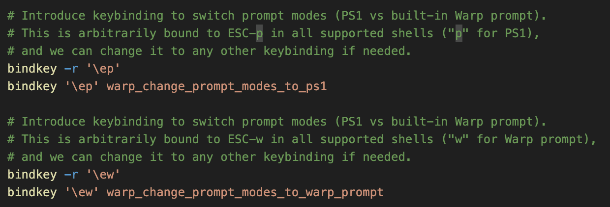
We give the shell this information by using environment variables and indicate changes with bindkeys. These are essentially keyboard shortcuts that we define in code that trigger shell functions. In the code below, we’ve defined ESC-P and ESC-W as bindkeys. When ESC-P is triggered, we know to respect the shell prompt to account for the left notch, and the opposite behavior when ESC-W is triggered. The underlying custom shell functions will update the environment variables appropriately and redraw the prompt (to display the correct prompt intra-session, without needing to open a new Warp tab).

Conclusion
In conclusion, the Same Line Prompt project demonstrates how a seemingly small feature request can be deceptively complex, at several different layers of the technical stack.
We hope that you enjoy using Same Line Prompt within Warp! 😀
